How I Painted Egyptian Blue Lotuses in Under 20 Minutes (Sumi-e Inspired Watercolor)
The Colors I Used (And Why I Love Them)
For this painting, I worked from my Rockwell Art watercolor palette and kept the palette intentionally simple. I started with a base of Angel Eyes, a light, sparkly blue, then dipped just the tip of my brush into Palaiba Diamond Blue — my absolute favorite blue — for loose, expressive petal strokes.
Fair warning: Palaiba Diamond Blue is strong. Even though I layered it over Angel Eyes, the Palaiba is what really shows up. If you only have one of those two blues, go with Palaiba.
For the greens, I used Onat Diamond Yellow (a warm green that carries most of the painting) and Limugreen Brown, a darker green I used for depth and shadows. I also finished the piece with a very dark indigo called Cosmic Sound for the line art details.
The Brush Technique: Inspired by Sumi-e
Every so often, I like to step away from my usual blending and fading style and do a painting that's purely focused on brushwork. This lotus painting is one of those. The approach is simple but requires intention:
Stroke. Lift. Move on.
No going back over a mark. No blending. Whatever lands on the paper, stays. I find this style forces a kind of confidence that's really good practice — and honestly, it's a great reminder that even if something feels like a mistake, most people won't notice it if you commit to it.
I also love that sumi-e-inspired work still requires strong compositional thinking. Even without a sketch, you have to visualize placement before your brush ever touches the paper.
Building the Painting: Petals, Buds, and Lily Pads
I built the entire painting — buds, flower, and lily pads — using one large brush I bought years ago when the Daniel Smith store in Seattle was still open. (Ah, those pre-pandemic days.)
For the flower, I painted the petals with loose strokes, then added small dashes between them to suggest the rear petals folding behind the bloom. Once the main shapes were down, I painted in the stems with a gentle curve — that flow is really important in this style.
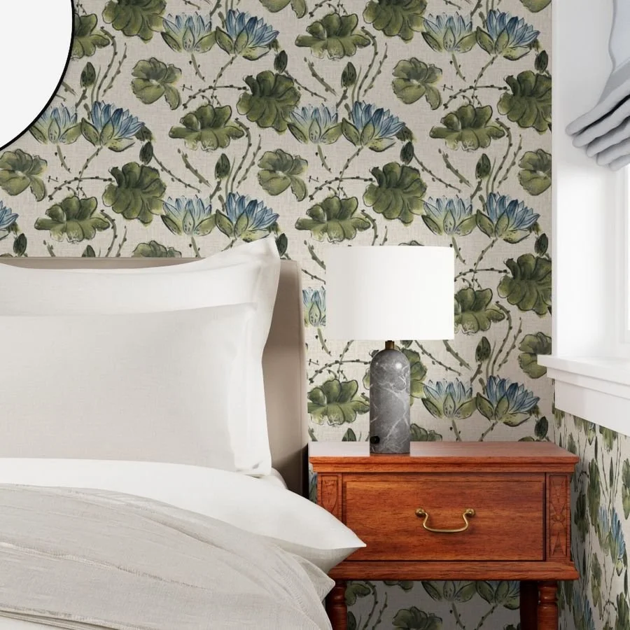
As I was painting, I had a happy realization: this composition would make a beautiful repeating pattern. I'm planning to develop it into a surface pattern for things like wallpaper, which is actually one of my most popular pattern categories. (Upholstery fabric has been trending up for me lately too!)
Let It Dry Naturally — Here's Why
After the initial painting, I let everything dry naturally rather than reaching for a blow dryer. I do this for two reasons:
Natural drying creates beautiful blooms and variations in the watercolor that I love and can't replicate with heat.
Blow drying makes my colors go pale and causes the paper to buckle more, which is genuinely annoying to paint on.
Speaking of paper — I used Arteza Expert 11×14 cold press paper for this. It's inexpensive and honestly works really well. It's not quite Arches-level quality, but for the price, it's fantastic. And bonus: this was actually painted on the back of another painting — a water lily design I scanned and vectorized into a pattern about a year ago.
If paper is still usable, I never throw it out. It's great for studies, as a custom palette surface, or for a whole new painting on the back.
Adding Line Art for Depth and Definition
Once the painting dried, I switched to a thinner liner brush and used Cosmic Sound indigo to add line art over the top. This is where the painting really came together.
The rule here is the same as before: go in confidently, make the stroke, lift, and leave it. No going over lines twice. I outlined the petals and added definition to those background petal dashes — which, without the lines, honestly looked a little mysterious. With the outlines, they clearly read as petals tucked behind the bloom.
I also used the side of the liner brush (not just the tip) to add textured strokes across the lily pads, painting one stroke per segment to give them visual interest and a little more depth. That one step made a big difference.
The Finished Painting: Quick, Loose, and Surprisingly Satisfying
The whole painting — sped up to 150% in the video — took less than 20 minutes in real time. A few colors, two brushes, and a loose, confident approach is really all you need.
I'll be scanning this piece to clean it up in Photoshop (there are a few orange Brusho powder marks on the paper — very well-loved sheet!) and I'm excited to develop it into a wallpaper or surface pattern down the line.
If you want to try something like this yourself, I really encourage you to embrace the sumi-e mindset: commit to your strokes, trust the process, and don't overthink it. The results might surprise you.