Painting Through an Internet Outage
Hi, I'm Valerie Englehart, and in this post I'm sharing a cluster of pink mushrooms I painted with my Fuumuui Pastel Opaque Watercolor Macaron Set. At the time I recorded this, my internet had been out for most of the day, so I could not do much of my work. It is amazing how everything, including my printer, uses Wi-Fi. I took it as divine intervention to grab some supplies and play around, because why not?
I pulled out one of the books I keep on hand filled with old scientific botanical illustrations, and this time I picked a cluster of mushrooms. In the book, just off to the side and out of shot, is a cluster of small mushrooms in black and white. I decided I wanted mine to be pink, in various shades. With every layer I put down, I switched to a different warm pink.
One bonus of working from a black and white illustration is that I get to use my imagination for color.
If You Can Only Buy One Brush
I worked with what appears to be a size 8 synthetic round brush. It is soft and has a nice fine point. As long as you have a round brush with a good fine point, you can paint most things. The tip gives you fine lines, and the side of the brush gives big, bold, wide strokes. It is incredibly versatile. If you can only get one brush, get a good round brush. A size 8 should cover you.
How to Fix a Color You Don't Like
At one point I went into my cooler pinks after finishing the warm ones. I put one down and did not like it, so I quickly grabbed a paper towel, pressed it onto the area, and lifted.
Do not scrub the page, because you will damage the paper. Even after pressing and lifting, the area is still damp. If I had wiped it, I would have smeared that dampness around, and the watercolor could have traveled into areas I did not want when I reapplied a new color.
Mushroom Shapes and Direction
Many of the mushroom caps look like what you would expect, oval or triangular. Some look like crescent moons. That is because those mushrooms are turned away from the viewer, which lets us see the gills underneath later.
For the stalks and stems, I chose a peachy orange and dropped in a light green. These colors are not just pastel, they can be fairly fluorescent, which is not like me.
Admiring a Style Without Having to Adopt It
I am not a pastel girly in the way I dress or the way I paint. Yet I keep admiring other artists with that beautiful, colorful, whimsical style, thinking I want to do that too. Then when I pull out those colors, I have a hard time, because it does not necessarily resonate with my creativity. That said, I had a blast with this piece, so maybe it does work for me, but only for little stylized illustrations.
My point is that you can admire a style or a color palette without having to do it yourself. If I truly wanted to make pastels my thing, I could, but I am not sure I do. That is part of a signature style. It is not necessarily picking something and sticking with it. It is finding what works for you and gives you the feeling you want while you paint. For me, that is usually earthier, granulating colors.
Creating Depth With Tiny White Gaps and Subtle Greens
When I paint stems, and even some of the mushroom caps, I leave a tiny sliver of white between elements that sit behind another element. This minimizes bleeding between shapes and helps push things back or forward in space.
I also use a light green throughout, but for stems in the background I use a leaf green, which is basically the light green but just a little bit darker. It is subtle, but it works, especially in person.
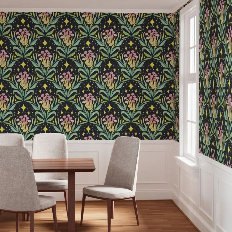
Could This Become a Wallpaper Pattern?
A nice thing about this style is that I can really get loose and relax, because I am not planning to do anything with this painting. It was just to fill time and feel productive while mourning my loss of internet. But with the clean, hard edges and whimsical, bright color palette, there is something else going on. Not only am I a fine artist, I design patterns too, typically for industries like wallpaper.
Once I get this scanned in and cleaned up, I am going to give it a shot as a pattern. Hopefully it becomes a really fun one, and if not, oh well, I had fun.
How Fuumuui Opaque Watercolors Handle
What makes these Fuumuui paints so opaque is the addition of white pigment. That feels strange to me as a watercolor artist who is not used to it. I know some watercolor paints contain white pigment, but it still throws me for a loop in the way these paints handle and mix. Even taking paint out of the palette feels different, since it is quite creamy. That is cool, but different.
I also found these paints do not do well with a lot of water on my brush when I am trying to be detailed.
I wonder if some of my frustration comes from mentally approaching this set as not serious or not real watercolor. Next time I pull these out, I should try my really loose, dreamy techniques, or paint a wash and then paint on top of it. To really understand how they handle, I should treat them like my other pigments and see what happens.
Line Work and Layering Light Over Dark
I pulled out a teeny-tiny liner brush to add line work on the tops of the mushrooms. This also shows where the top of the mushroom is, and therefore which direction it points. The light pink mushrooms get a darker pink pattern, and the dark mushrooms get a lighter pink, which pops more.
That is one of the nice things about these paints. Because they are opaque, I can layer a light color on top of a dark color. This set does not come with white, so if you want white, keep some gouache on the side.
Happy Accidents
I was trying to avoid bleeding, but on one mushroom cap, some of the peach and green bled into the top, and I really like how it turned out. It gave a nice subtle blend, and the lighter colors make that mushroom pop out in space, in addition to the white space I left around everything behind it.
Painting the Gills
For the gills, I brought out that same green for color cohesion and painted radiating spokes. I was not liking it, so I grabbed my round brush and smudged it after letting it dry for a couple of seconds.
It is hard to see on camera, but the lines are technically still there, just far more subtle. I like it because it looks like it is reflecting light instead of showing the stark white of the paper. It will also make things easier when I digitize this, because Photoshop will not read it as white and try to take it away from me.
Since I tried it on one mushroom, I did it to the other two as well. I painted the lines and gave them a little smudge. Later I painted over them with mint, but I forgot to turn my camera on for that part.
Would You Put Pink Mushrooms in Your Home?
Wallpaper has been popular lately with really cool, funky patterns. Would you put pink mushrooms in your house?
Final Thoughts:
A good size 8 round brush with a fine point can handle most of what you want to paint
Press and lift with a paper towel to remove a color you do not like, instead of scrubbing the paper
Leave tiny slivers of white between overlapping elements to control bleeding
Slightly darker greens help push background elements back in space
You can admire a style without adopting it, and your signature style is about what feels right to you
Opaque watercolors let you layer light colors over dark, though a set without white may need gouache on the side
Valerie Englehart is a watercolor artist and signature member of the Northwest Watercolor Society. She's passionate about helping artists loosen up and paint boldly and intuitively.