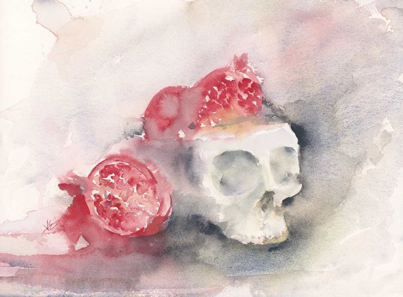
Revisiting Old Art: Transforming a Two-Year-Old Skull and Pomegranate Painting
Why Revisit Old Artwork?
Hi, I'm Valerie Englehart, and today I want to talk about something I think many artists can relate to: holding onto paintings that aren't quite sellable or frame-worthy, but that just sit in a book collecting dust. If you're like me, you have stacks of these pieces. So here's my philosophy—if a painting isn't doing anything for me, why not use it as an experimental piece to learn new techniques?
The worst that can happen? It becomes a disaster. But either way, it's just rotting in a book, so let's have some fun with it!
Painting in the “before” stage.
Choosing the Right Painting to Transform
Since it was around Halloween time when I filmed this, I pulled out a painting featuring a skull and pomegranates. There were actually quite a few things I already liked about this piece—the loose quality at the top of the pomegranate, how the red bled into the shadow areas. But I knew I could do more now with the skills I've developed.
Introducing Daniel Smith Lunar Black
The star of this transformation was a color I picked up this year: Daniel Smith Lunar Black. I love it because it's super granulating, which creates beautiful texture and depth.
Now, I know what you're thinking—many watercolor books tell you to shy away from black because it can deaden a painting. But modern approaches tend to embrace black, and there are quite a few black paints out there specifically designed for watercolor. Lunar Black has become one of my favorites.
For this painting, I was working on what I'm pretty sure is Arches rough press, 140-pound paper.
Starting Bold: The Eye Socket
I loaded up my round size 10 brush and decided to just pick a spot and see what happens. I went straight for the eye socket with super dark black paint. It looked almost cartoonish at first, which made me wonder if I'd made a mistake—but you won't know until you try!
Working with Granulating Paints
One thing to know about granulating paints like Lunar Black: they lift easily. I rinsed my brush, got it pretty wet, and lightly glazed over what I had painted before, letting the new paint connect with the old layers. The key here is not to scrub, or you'll lift what's underneath and create mud. I just gently dragged the paint around with water and let it drip naturally.
Remember, watercolor dries paler, including this black color, so don't be too afraid. Plus, it's just a painting—why be afraid?
Creating Depth and Connection
I used the shadows I had already painted as a roadmap. Anywhere I wanted to connect areas, I essentially glazed over what was there before with a very soft brush. As I worked, I kept looking and seeing what made sense.
Fixing the Teeth
The teeth I had originally painted looked way too small, so I grabbed a smaller size three synthetic brush and painted some little triangles for new teeth. Were they anatomically perfect? Probably not. But I wondered how many people would actually notice unless they're very familiar with human skull anatomy.
Embracing the Grungy, Spooky Aesthetic
One thing I realized as I worked is that for a spooky painting like this, the grungy look actually works quite well. Because watercolor is transparent, I could still see the shades of red underneath from the original painting, and that added to the moody atmosphere I was going for.
The Magic of Water and Gravity
I love working with gravity in watercolor. By tilting my paper and using a spray bottle to add fat drops of water, I could encourage the paint to flow in specific directions. This technique creates beautiful organic drips and textures.
Fair warning: This method requires holding your paper at an angle for extended periods. My painting wasn't on a block, so it started warping and bending—but that's okay! It's all part of the experimental process.
Learning from "Mistakes"
At one point, I got greedy and didn't wait for an area to dry completely before adding more paint. The result? Some drips went where I didn't want them. But here's the thing: I learned something. Don't get greedy!
When unwanted drips happened, I used the press-and-lift technique with paper towels. Find a dry spot on your paper towel, press (don't rub), lift, and repeat. This helps control the mess without completely ruining the effect.
Adding Dimension to the Pomegranates
While the skull was getting all this attention, the pomegranates started to feel neglected. So I mixed some Permanent Alizarin Crimson with a bit of that Lunar Black to create shadows by painting negatively—meaning I painted around the shapes to define them.
The Importance of Color Variety
Pomegranates aren't just red—they have that yellowish rind too. So I added some Yellow Ochre to create subtle tonal shifts. Even though watercolor is transparent and Yellow Ochre won't show up dramatically, those slight color tone shifts can really affect a painting.
I painted little triangles here and there to suggest the individual arils (that's the actual word for pomegranate seeds—I had to remember it!), then blended them out. The key is offering suggestions and letting viewers' imaginations fill in the rest.
Creating a Vignette
After letting things dry a bit, I realized I had a compositional problem. Even though the painting looked cool, my eye kept escaping off the top of the page. I needed to create a vignette—something to bounce the eye back into the focal point.
So I recreated the dark, drippy effect from the bottom of the painting at the top. This involved:
Squeezing out fresh, super juicy pigment
Tilting the paper
Using loose fat drops from the spray bottle
Letting it get messy and chaotic
Did some drips go where I didn't want them? Absolutely. But I embraced it, cleaned up what I could with the press-and-lift method, and kept going.
The Final Touch: Gouache Highlights
For the finishing touch, I grabbed some gouache that had been sitting on my palette (no waste!) and reconstituted it with water. Using my size three synthetic brush, I added tiny bits of shine to some of the pomegranate arils.
I was careful about where I placed the highlights, making sure they all came from the same light direction. I didn't need to add shine to every single aril—just enough to give a little more dimension.
Standing While You Paint
One tip I want to share: I like to paint standing up when I'm working like this. It helps me get a better idea of the whole picture, and I find I'm more engaged with the piece when I'm on my feet.
Lessons Learned
So what did I learn from this transformation?
Don't be afraid of black paint—especially granulating blacks like Lunar Black
Be careful layering on top of Lunar Black—it's so granulating that you can easily move things around
Patience is a virtue—but if you're impatient like me, just be ready to problem-solve
The paint is only wasted if it stays in the tube—use lots of pigment!
Take chances, make mistakes, get messy (thanks, Ms. Frizzle!)
The Verdict
Did this painting get messy and chaotic? Yes. Did we get something cool happening? Also yes. The transformation took a painting that was just sitting in a book and turned it into something with much more drama, depth, and visual interest.
My eye no longer escapes off the page—the dark vignette brings it back to the skull and pomegranates. The granulation from the Lunar Black adds incredible texture, especially in the eye socket and shadow areas. And those little touches of gouache on the pomegranate arils? They really make the fruit pop.
Your Turn
I'd love to know what you think—is the painting better after this transformation, or did you prefer it before? And if you try any of these techniques on your own old artwork, please tag me on Instagram @valerie.englehart so I can see your results!
Remember, those old paintings sitting in your books are just waiting for a second chance. Why not pull one out and experiment? The worst that can happen is you learn something new.
Happy painting!